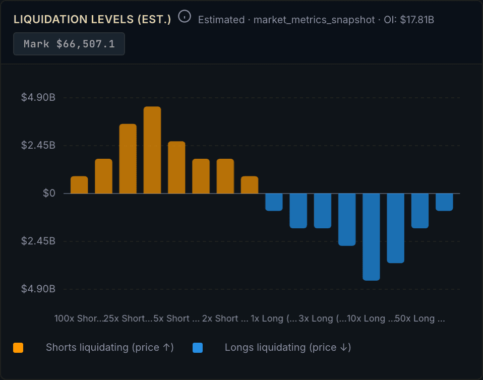
TLDR: A liquidation heatmap estimates the price levels where leveraged positions would be force-closed, and shades them by how much size is stacked there: dark for thin, bright for dense. The bright bands mark "clusters" where a lot of leverage would get liquidated at once, which is why price often gets pulled toward them. The single most important thing to know is that a heatmap is a *model*, not a record: exchanges do not publish individual liquidation prices, so every cluster on the map is an estimate. This is education only, not a buy or sell call.
Liquidation heatmaps are one of the most visually compelling tools in crypto, and one of the most misread. Traders see a bright band, decide price "has to" go there, and treat an estimate as a prophecy. Used properly, a heatmap is a map of where leverage is fragile, not a schedule of where price will go. Here is how to read one, and exactly where its honesty ends.
What is a liquidation heatmap?
A liquidation heatmap is a chart that estimates, across a range of prices, how much leveraged position size would be liquidated if price reached each level. Price runs up the vertical axis, time along the horizontal, and a colour scale shows intensity, typically dark for low concentration and bright (toward yellow) for the densest liquidation zones.
It is built by aggregating open leveraged long and short positions across major futures venues and modelling, from leverage usage and position data, the notional value that would be force-closed at each price band. The dense bands that result are the "clusters." Providers such as Coinglass compute these across timeframes from hours to a year.
How do you read the clusters?
Read brightness as *fragility density*: the brighter the band, the more leveraged size is estimated to get liquidated if price reaches it.
- Bright clusters above price are pools of leveraged *shorts* that would be liquidated on the way up. If price rises into them, those shorts get bought back (forced buying), which can accelerate the move higher. - Bright clusters below price are leveraged *longs* that would be liquidated on the way down. If price falls into them, forced selling can accelerate the drop. - Thin, dark areas are price ranges where little leverage is parked, so there is less fuel for a self-reinforcing move.
This is the same engine behind a liquidation cascade: price reaches a cluster, forced liquidations fire, those orders push price further into the next cluster, and the move compounds.
What is a "magnetic zone"?
A magnetic zone is a dense cluster that price tends to drift toward. The logic is mechanical: a large stack of positions near a price level means that, as price approaches, the probability of triggering those liquidations rises sharply, and the resulting forced orders pull price the rest of the way. Liquidity sits where the liquidations are, and price often hunts liquidity.
"Tends to" is doing real work in that sentence. The magnet is a tendency, not a law. Price can stall, reverse, or ignore a cluster entirely, especially when spot demand or a macro catalyst overwhelms the leverage picture.
Why does the venue set matter?
A heatmap built from one exchange only sees that exchange's leverage. Because liquidations on one venue spill into the whole market, a cluster is only meaningful when it reflects leverage aggregated across venues, not a single book. Athenum's liquidation heatmap view aggregates estimated liquidation levels across the major derivatives exchanges, and sits next to the open interest and funding data that explains *why* the leverage built up where it did.
The honest caveat: a heatmap is a model, not a record
This is the part most guides skip, so read it twice.

Realized BTC liquidations per hourly bucket over the last 168 hours: $97.9M of longs against $53.0M of shorts, a net $45.0M, spread across 160 active buckets. This is the record a heatmap estimates, not the heatmap itself.
Exchanges do not publish the actual liquidation price of every position. A heatmap therefore does not *know* where liquidations sit; it *estimates* them from leverage assumptions and position data. Different providers make different assumptions and produce different maps of the same market. Treat every cluster as an educated estimate with error bars, not a measured fact.
Two more limits follow from that:
- It can be self-defeating. When a cluster is obvious to everyone, traders position around it, which can blunt or invert the very magnet effect the map implies. A widely-watched level sometimes becomes the one price refuses to reach. - It is not a timing tool. A heatmap shows *where* fragility sits, never *when* price will get there, or whether it will at all. It cannot account for spot flows, news, or liquidity that appears in real time.
Used well, a liquidation heatmap is a risk map: it tells you where a move could accelerate and where your own leverage would be in danger. Read it alongside open interest, funding and spot demand, treat the clusters as estimates, and never mistake a bright band for a promise.
*Education only. Not investment advice. No buy or sell recommendation is made or implied.*
Sources: - CoinGlass, "How to use Liquidation Heatmaps to assist trading." - CoinGlass, BTC Liquidation Heatmap (product reference). - Webopedia, "How to Use a Crypto Liquidation Heatmap." - Bitget Academy, "Best Crypto Liquidation Heatmaps & Data Platforms 2026 — Accuracy Review."
One terminal. All the data.
Liquidations, orderbook depth, whale walls & open interest from 4 exchanges, all real-time, in one place.
No credit card required
